Decades of design: How American interior design trends reflect our history
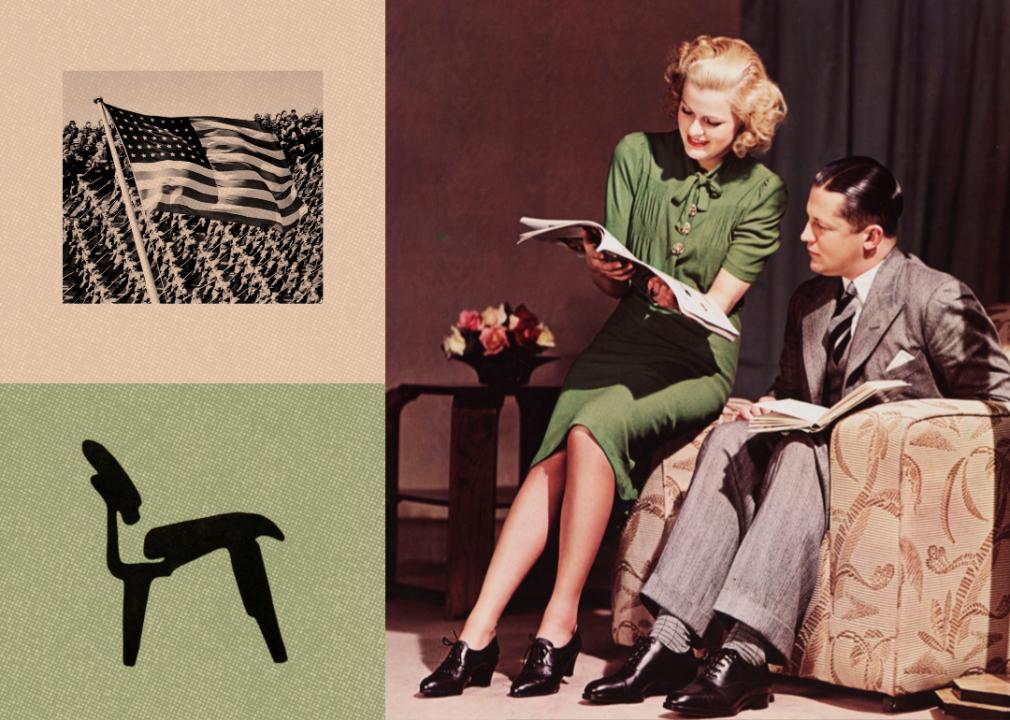
Photo Illustration by Stacker // Getty Images
Decades of design: How American interior design trends reflect our history
A couple sitting on a couch reading a magazine, World War 2 soldiers with an American Flag, and an Eames LCW silhouette.
From decade to decade, our personal spaces have reflected the times, impacted by the events of each era that influence not only the nation’s temperament, but also the availability of materials and objects to furnish homes.
To relive the most memorable design movements over the last 100 years, Living Spaces traveled back in time via archival home images in magazines, libraries, museum collections, and Instagram accounts. Historical overviews by Architectural Digest, Interior Design, and Better Homes & Gardens also provided insights into the pivotal events of the era that helped shape American interior design.
Each era brought us something fresh—the post-World War I glamour and optimism of the Roaring ’20s that embraced the extravagance of art deco design, the technology boom after World War II, the earthy palette and handcrafted furnishings of the ’70s after the first Earth Day, and the influence of technology and 21st-century home design stars making interior design accessible to all.
Step into our time machine and learn of the many trends that may have you waxing nostalgic about your childhood home or first apartment. Thankfully, many of these trends make comebacks time and again.
![]()
General Photographic Agency // Getty Images
Luxe and more in the 1920s
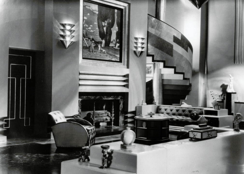
An art deco living room.
There was much to celebrate during the Roaring ’20s: a booming economy, women’s right to vote, steamship and air travel. There was a feeling that anything was possible following the victory of the Allied powers in World War I, and art deco embodied this.
Introduced at the 1925 Exposition Internationale des Arts Décoratifs et Industriels Modernes in Paris, designers expressed art deco through luxurious upholstery and heavily ornamented decor. Glamour was key. Bold patterns and stylized interpretations of natural wonders like sun rays and geometric ones like chevrons abound in everything from wood inlays to chandeliers and doors. But not everyone embraced or could afford such extravagance.
Enter German Bauhaus design, which was more accessible with mass-produced furniture. It saw beauty in simplicity, stripping furniture down to its essence in form and shape. Marcel Breuer’s revolutionary Wassily Chair, designed in 1925, exemplified this: no cushioning, heavy upholstery, or wood base—just strips of leather stretched tight across a tubular steel frame.
Print Collector // Getty Images
Paring down during the 1930s
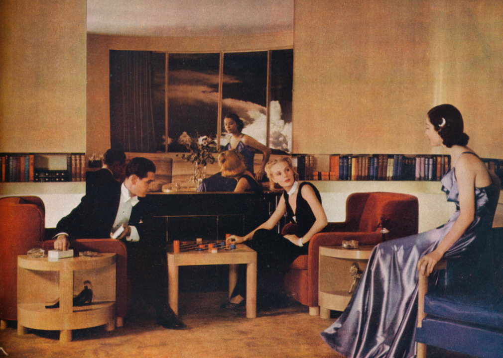
Illustration of a living room designed by Paul MacAlister.
The country had just entered the Great Depression, which would last through the decade. Americans had little, if any, disposable income. Basic necessities became the priority, reflected in the move toward a more minimalist, industrial-influenced approach to furnishings.
Art deco was still in play with its geometric patterns and sleek, showy materials such as lacquer, glass, and mirrors, as well as skyscraper-esque furnishings. (The Chrysler Building and Empire State Building both opened at this time, in 1930 and 1931, respectively.)
Then streamline moderne arrived with the Chicago World Fair’s “A Century of Progress.” This style was a pared-down version of art deco and heavily used the latest engineering technologies. Streamline moderne was characterized by long, clean lines and transportation design-influenced, aerodynamic shapes such as ships or bullets.
Instead of angled tables and appliances, rounded edges became more prevalent, along with the use of steel, glass, and less expensive materials. Colors and patterns were also more muted than in the previous decade.
Mondadori via Getty Images
Tech on the rise in the 1940s
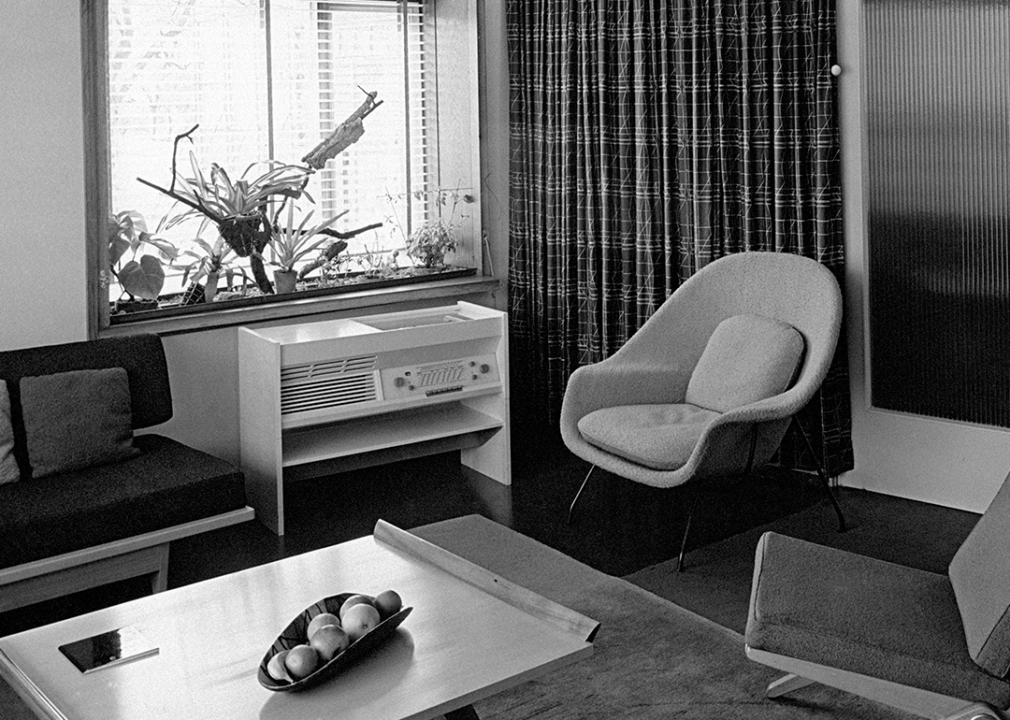
A living room with an Eero Saarinen womb chair.
America entered World War II at the end of 1941, shifting factories’ priorities from consumer demands to supporting the war effort. During the war, technology developed, allowing for the mass production of furniture at more affordable prices and using materials such as plastic and fiberglass.
Form, function, and optimism were the driving forces of one of the most popular design styles: modernism. Glass, metal, and wood were still heavily used but with even less ornamentation than in the 1930s.
During this time, one of the most enduring Charles and Ray Eames lounge chair designs, the plywood LCM featuring metal legs, was produced in Los Angeles. Also notable in the late ’40s was the launch of the iconic womb chair by Eero Saarinen, an upholstered and pillow-cushioned chair that hugged the body and sat on a metal frame.
Tom Kelley/Hulton Archive // Getty Images
Modernism in full bloom during the 1950s
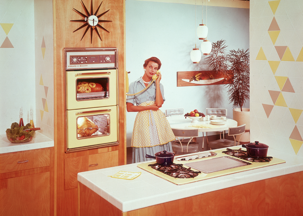
A woman stands talking on the phone in the kitchen.
People had more money to spend with the financial prosperity that followed WWII. The lush interiors of old Europe still found their way into upper-class Americans’ homes: decorative upholstered chairs, grand chandeliers, gaudy gold frames, and antique tables worthy of royalty. But a more contemporary aesthetic started to emerge in contrast. Fewer frills, an emphasis on function, and clean lines defined the popular midcentury modern and Scandinavian styles.
Many iconic pieces still in demand today arrived, such as the Eames molded fiberglass chairs and Saarinen’s pedestal tulip fiberglass chairs and iconic dining tables. The single-story ranch home reigned in terms of residential architecture, with most featuring open-floor plans with dining areas bleeding into living rooms versus being separated, allowing for larger communal spaces to entertain.
The pastel color palette of the era, including lilac and soft pink, was calm yet uplifting, with more showy colors (dusky red and turquoise) also making a statement in homes.
FRANCOIS GUILLOT/AFP via Getty Images
Future-forward in the 1960s
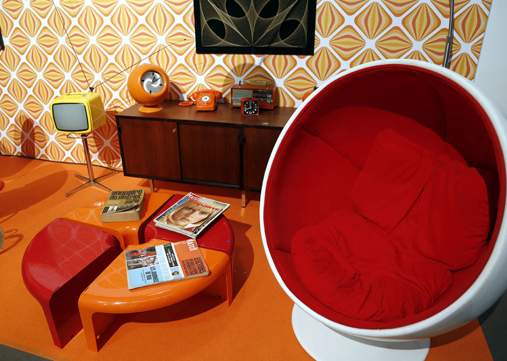
Verner Panton furniture at an exhibition in Paris.
A rejection of the status quo embodied in counterculture, antiwar movements, and the excitement of the Space Race influenced ’60s home interiors—vibrantly colored flower-powered patterns on walls and upholstery celebrated self-expression.
Widespread recreational drug use accompanied the counterculture movement, with lava lamps and black lights (and psychedelic posters specifically designed for them) illuminating rooms and entertaining the eyes with trippy colors and shapes.
Stretching people’s imagination also came in the form of futuristic lighting such as the rippling Splügen Braü aluminum pendant light and the swooping Viscontea lamp, both by the Castiglioni brothers, as Americans sought to venture into worlds beyond Earth’s atmosphere.
Scandinavian design also brought stylish open wood shelving units and shelves to display brag-worthy collections and Verner Panton’s curvy, legless plastic chair into homes.
f8 Imaging/Hulton Archive // Getty Images
Inspired by environmentalism in the 1970s
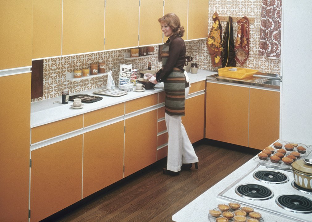
A woman baking in a gold and brown kitchen.
The first Earth Day celebrated in 1970 marked a move toward environmentalism, and an earthy color palette followed to dominate the decade. Designers applied rust, brown, avocado green, and mustard yellow to everything, including furnishings and appliances.
Wood paneling, comfy seating, and macrame galore were some of the features that spoke to the casual, laid-back interiors of the ’70s. With sunken living rooms, shaggy carpet, and furniture you could sink into, like bean-bag-like seating, waterbeds, and low-back couches, the theme was relaxation.
Home design also showed less restraint, favoring open plans and natural materials, like wood, leather, and rattan, over steel and handcrafted items over machine-made.
Monica Schipper/WireImage // Getty Images
Postmodern party times in the 1980s
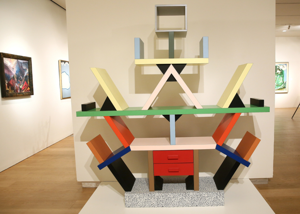
An Ettore Sottsass bookcase on display at Sotheby’s.
By the mid-1980s, nearly every American household had a TV—MTV was on 24 hours a day—and, on average, people were glued to their sets for 7 hours a day. The decade’s most popular heavily influenced how Americans furnished their homes.
Many took inspiration from their beloved characters’ home decor, such as the neon color palette and glass-block walls of “Miami Vice,” the luxurious, drape-heavy rooms and plush seating of “Dallas” and “Dynasty,” and the frill and tropical-inspired furnishings of the “Golden Girls” (remember Blanche’s banana leaf wallpaper and bedspread?).
For the more rebellious set, a group of Italian designers and architects, the Memphis Group, introduced the world to their postmodern eponymous design style of vibrant colors, contrasting palettes, edgy patterns, and asymmetrical furniture pieces—a commingling of art deco and pop art influences, which would in turn shape graphic, fashion, and product design. Think wild geometric and confetti prints, the MTV logo, and Swatch watches.
Anntuan // Shutterstock
Good fortune in the 1990s
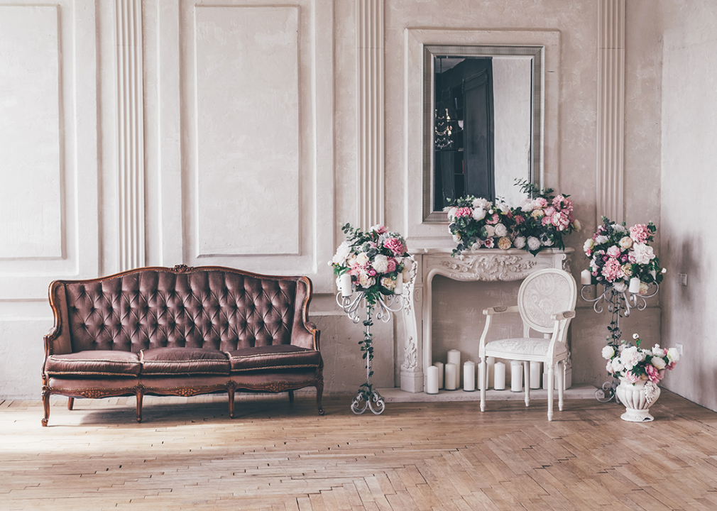
A vintage interior sofa with a vase of flowers in a shabby chic style.
Progress and prosperity were felt across the nation: The Cold War ended, American household incomes rose, and violent crime was down, among other positive developments. This mood encouraged people to experiment, play, and show individualism in their homes.
Sponge-painted and decal-covered walls, floral and gingham decor, shabby chic interiors filled with frilly fabrics and worn pieces—anything went during the era. Upcycled pieces were in vogue with the sustainability movement gaining ground, while others embraced maximalist tendencies with clashing, colorful-patterned furniture.
Influenced by a NASA study that suggested houseplants could help filter air pollutants, homeowners added greenery to their interiors, hanging plants from walls and placing them on shelves with vines trailing in all directions,
During this time of relative peace, people looked to extend that sense of calm or positive energy to their immediate surroundings—feng shui principles and zen design determined the flow and placement of items in the home.
Michelle Marsan // Shutterstock
Well-being during the 2000s
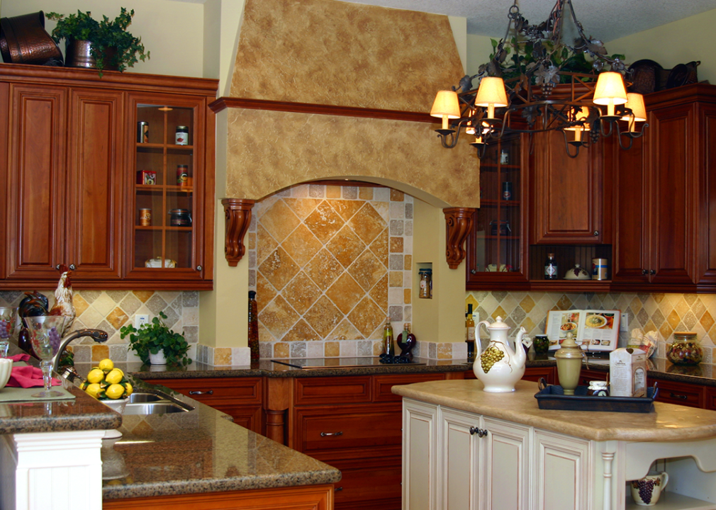
A Tuscan-style kitchen with tile and a center island.
Just as the anxiety over the arrival of Y2K abated, the country suffered the deadliest terrorist attack in U.S. history on 9/11. Architects and urban designers responded with designs of buildings and public spaces to make people feel more secure and at ease. Likewise, Americans sought safety and comfort in their homes following the attacks.
A green living movement encouraged using natural (and repurposed) materials and plants as people started reflecting more on their impact on Mother Earth.
McMansion dwellers found warmth and Old World charm in the Tuscan design aesthetic, particularly in the kitchen, emphasizing earth tones, decorative wood cabinetry, and other ornamentation.
Security fell by the wayside, however, when the Great Recession hit. The era saw stunning job losses—15 million-plus people were unemployed by decade’s end—and foreclosures, forcing millions to lose their homes.
Flaunting one’s wealth, whether in one’s clothes or the interior design of one’s home, was frowned upon, keeping the minimalist aesthetic alive. Others opted for secondhand furniture versus purchasing new items to refresh their living spaces.
Followtheflow // Shutterstock
DIY in the 2010s
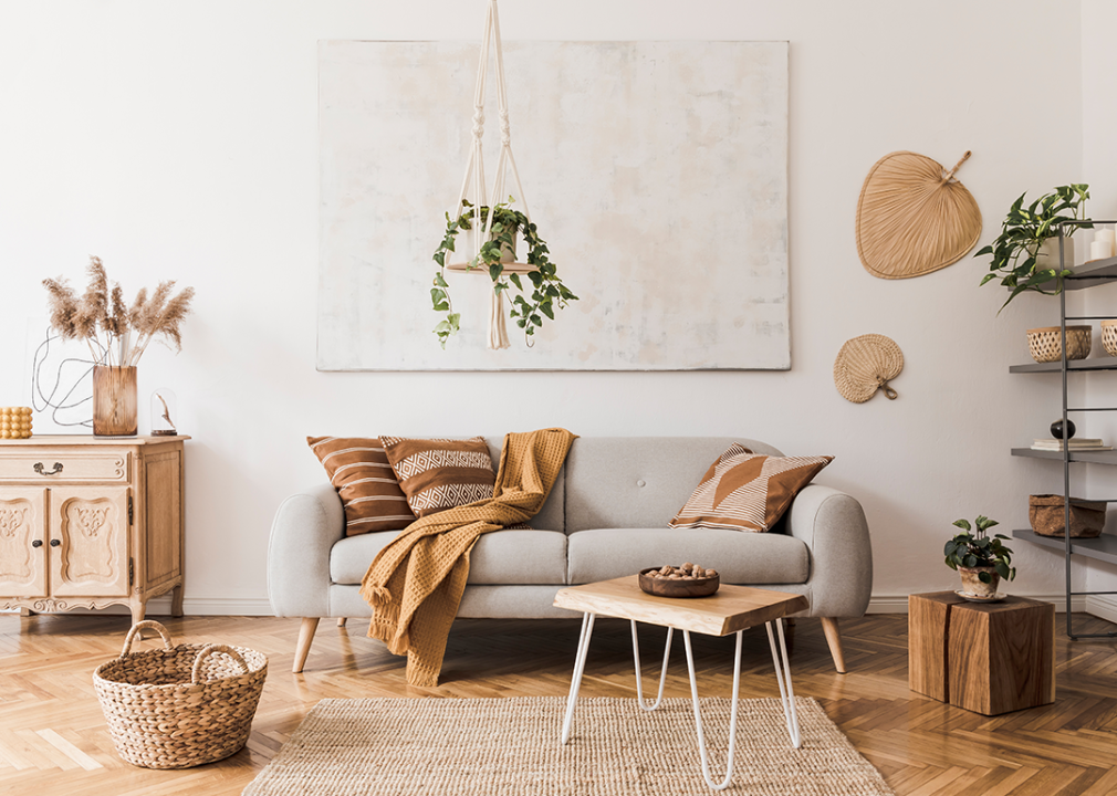
A living room with a boho, but minimalist style with mostly white and neutral colors.
America was still feeling the effects of the recession into the 2010s, so budgets were tight. But there was also excitement over the design possibilities with the rise of apps like Pinterest and Instagram, which provide an endless supply of visual inspiration that fits every budget.
Even if you couldn’t afford a high-end item, retailers offered inexpensive knockoffs (of midcentury modern furniture, for instance) or DIY solutions to reimagine existing pieces featured in blogs, YouTube videos, and home design shows.
Being more connected than ever globally brought cultural objects from abroad—Moroccan poufs, carved wood cabinetry and tables from India, and African patterned textiles—to decorate homes more than ever. More sustainable practices in furniture production would see a rise in reclaimed wood use and lasting pieces versus disposable ones.
“Fixer Upper” hosts Chip and Joanna Gaines helped popularize modern farmhouse features like shiplap and worn wood furniture, while maximalists enjoyed layering different styles and objects. Decorators put together flea-market finds with new big-box store items. Whether one wanted a boho- or industrial loft-style look, there was no shortage of options.
Story editing by Carren Jao. Copy editing by Kristen Wegrzyn.
This story originally appeared on Living Spaces and was produced and
distributed in partnership with Stacker Studio.